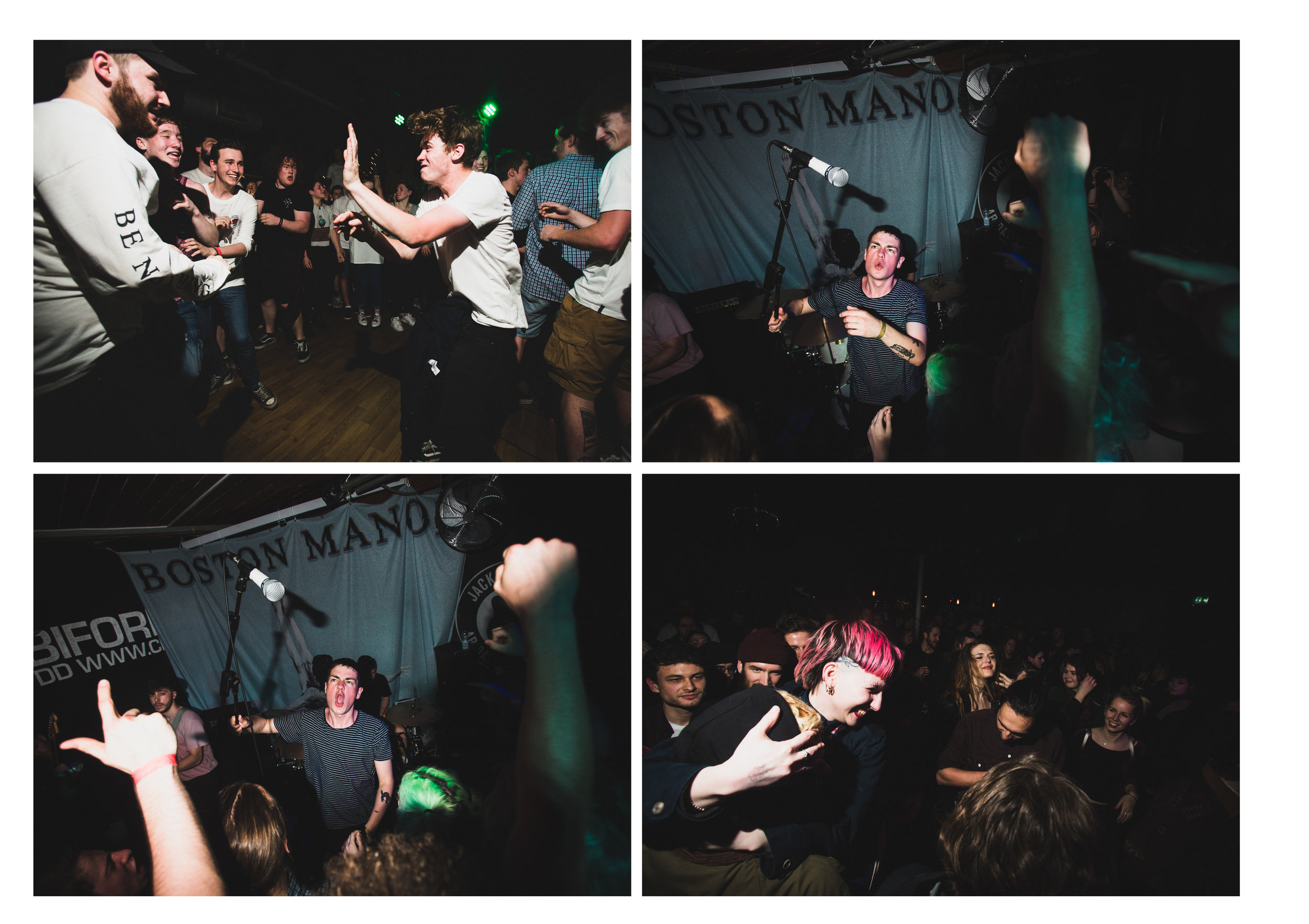
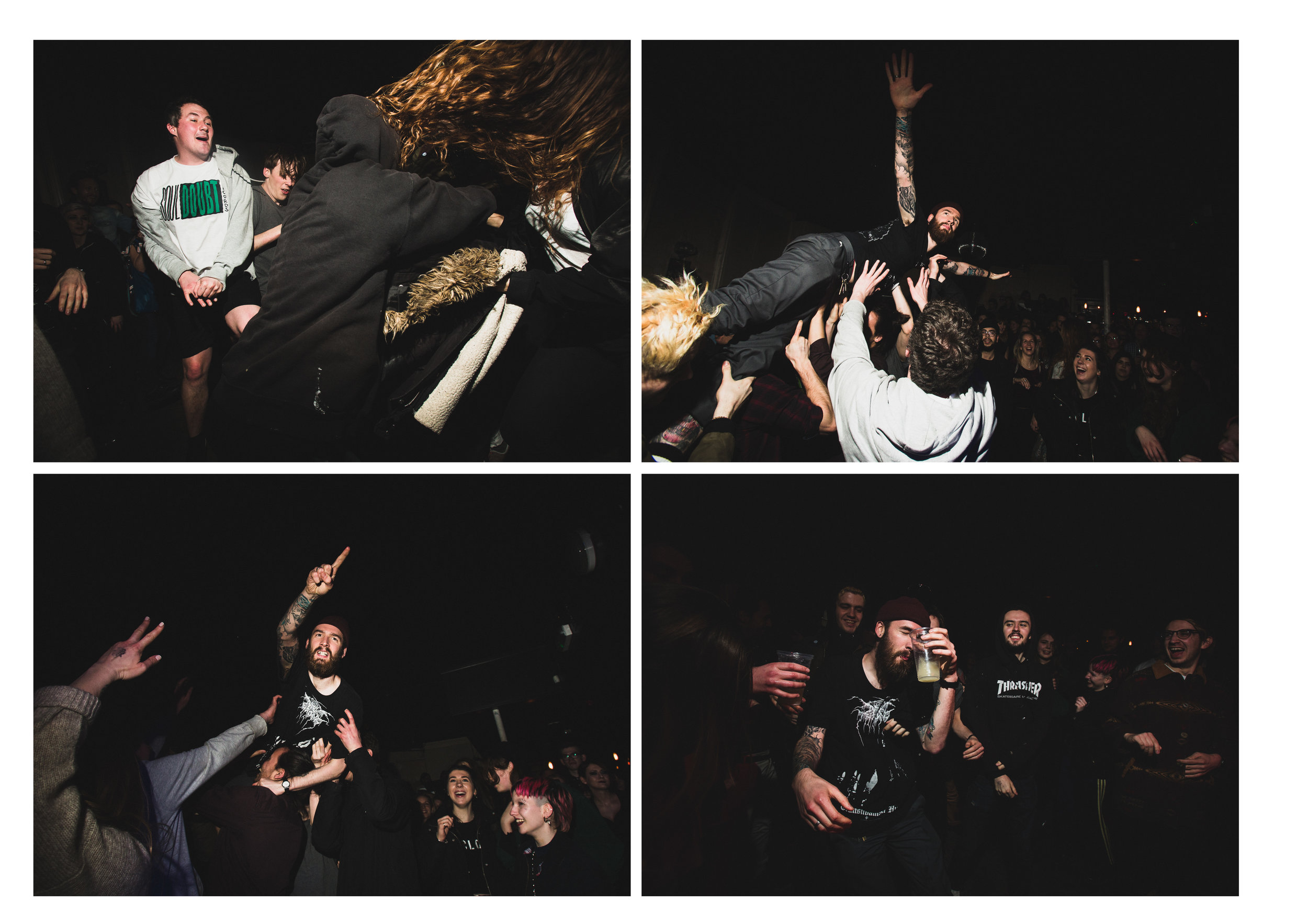
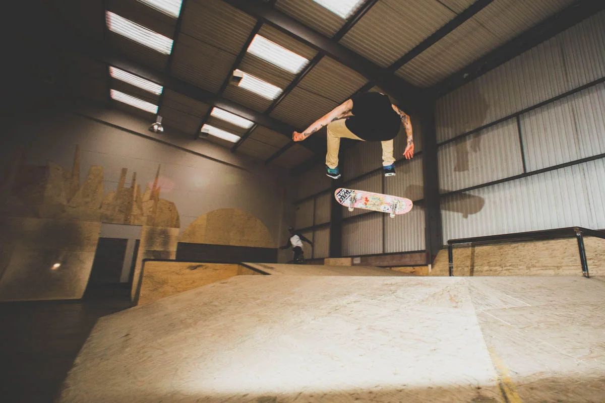
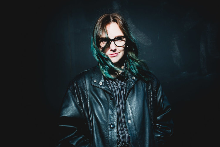
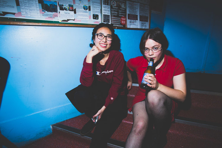
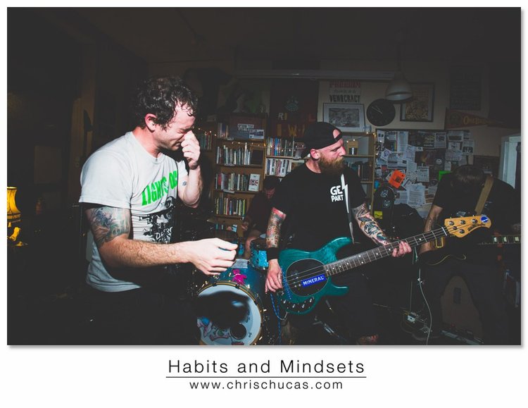
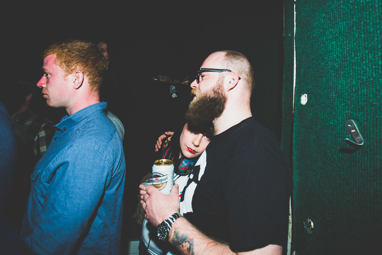
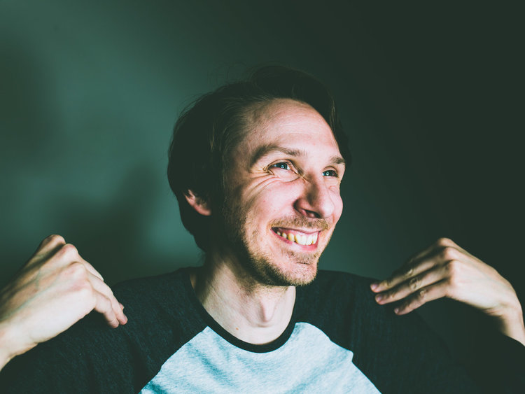
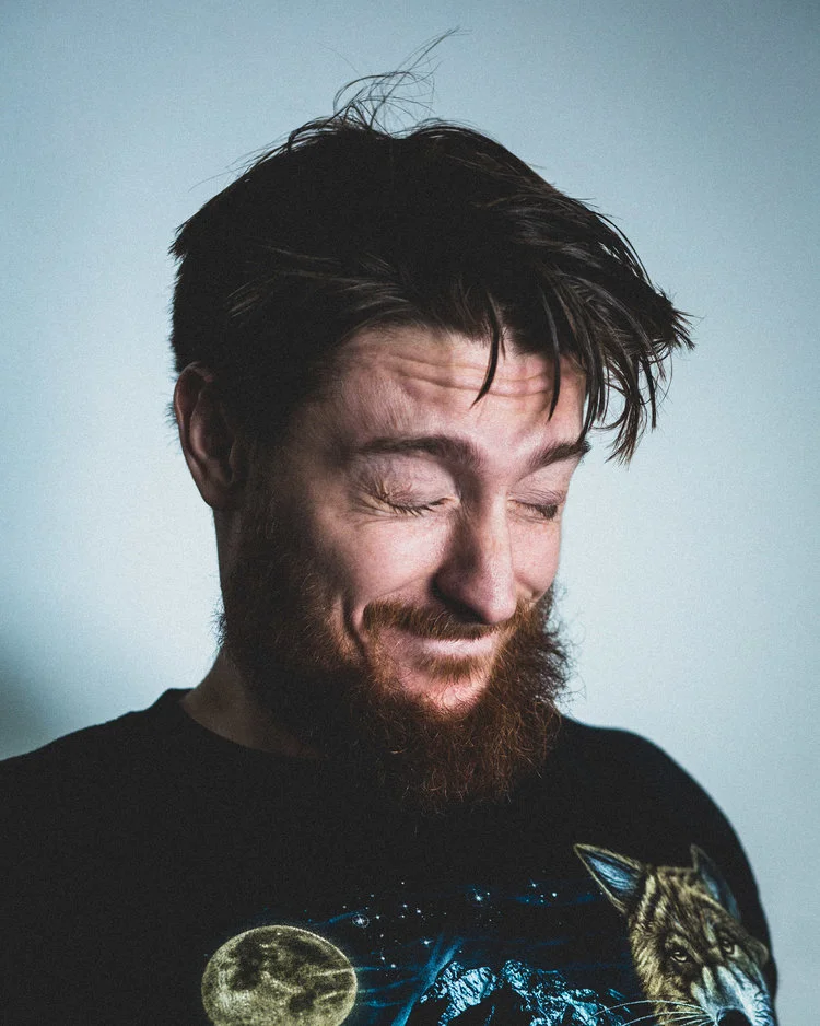
Thinking hard about what I am trying to archive and convey along with the talks I’ve had with Spencer I took onboard his thoughts and agreed that it would bennifit the project if I narrowed down the range of emorions. Taking out the smiling portraits that convey positivity and happiness contradicted the flow of the set. I want to add that it’s not all doom and gloom feeling wise but to narraw a aset down to a small amount of images like 16 its very difficult to portray a continuity with such a vast range. I defiantly want to use those positive looking images but probably for online content ( art collective - online magazine ) or book. Right now I’m focusing on the FMP set and I’m aiming for 16 images. Ive done this as it makes a nice grid with 4:3 format and can be displayed as a set in one screen to be shared which will help with its exposure to have a neat digital home for it.
Thinking about what we talked about my focus was to
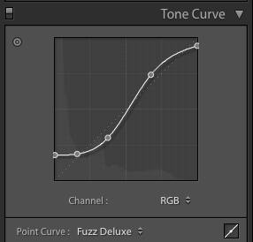
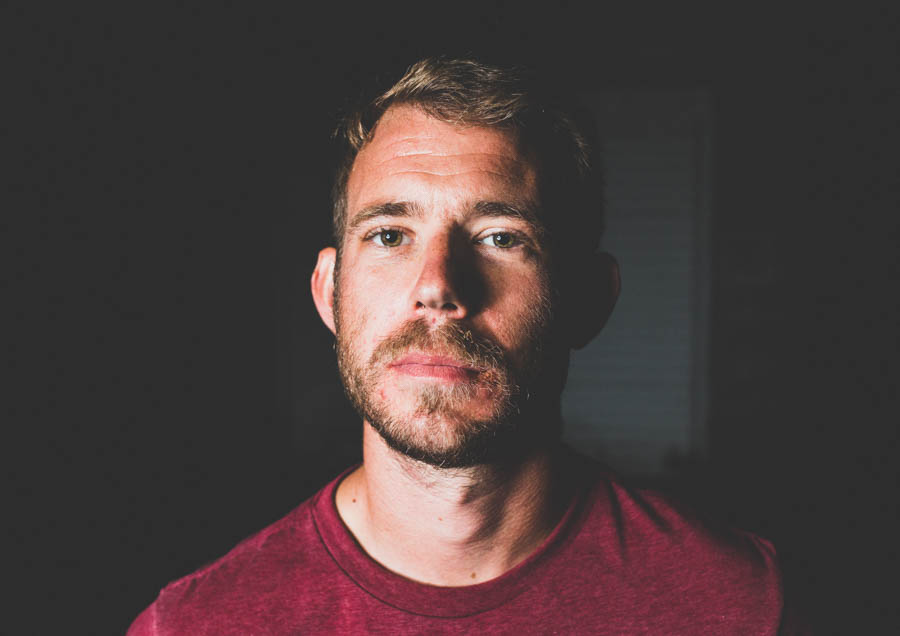
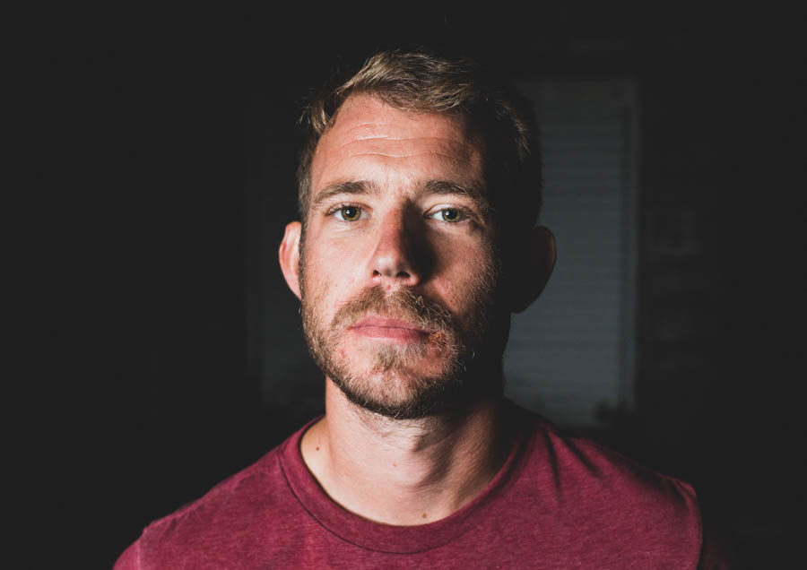
fix the digital process issues with the lighted blacks ( which I had done)
break up with edit with some lighter images to help the flow
look at swapping the overly smiling portraits out with others that reflect similar themes of present in the others
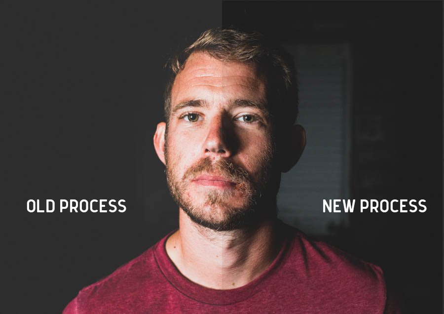
I made an attempt to move from this -
trying to fix the darnkess issue with the set.
After checking in, we talked and he thought that the process issue has been fixed, the colour is working a better more variety but the smiling portraits could still need addressing.
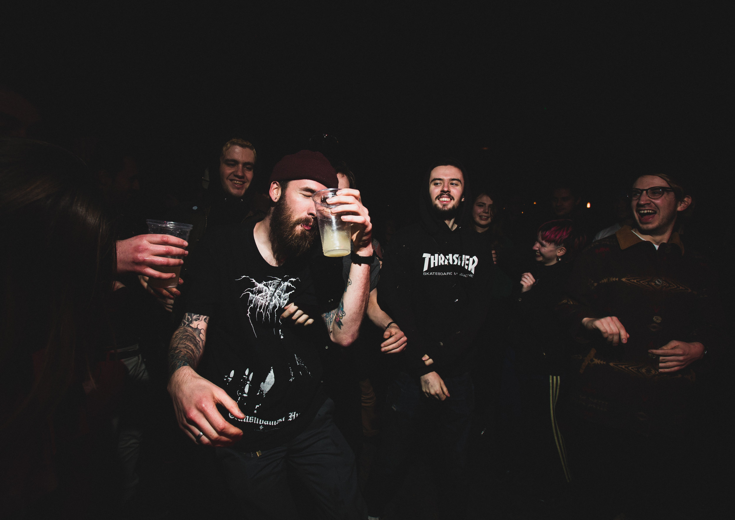
I talked through the progression I’ve had and how I’ve moved away from a looser approach (something he thinks I should stick with ), into a more conventional editorial style. I’m torn but I’m happy with the informality the text brings to the images and i’m happy with the formalness of the editorial images almost attacked with text in the way I’ve designed it. I’ve deliberately stayed away from conventions that categorize images into ‘music’ or ‘live action ‘ photography because I feel that the message I’m trying to convey would be lost to a lot of people if it were recognised as such. The use of text is helpful in that regard. So I feel like I owe it to myself to my original roots and style to include an image or 2 to pay homage to that and the whole shots that started the journey with this project to begin with. I got the idea from chatting to Spencer and him bringing up the looser style. ( see the start of the conversation here in this post) -
https://www.chrischucas.com/crj2/fmp-spencer-murphy-workshop-1
After thinking about options I sifted though images made some choices and sat with them. I finally came to this edit.
Work shop 3 set Chris Chucas 2018
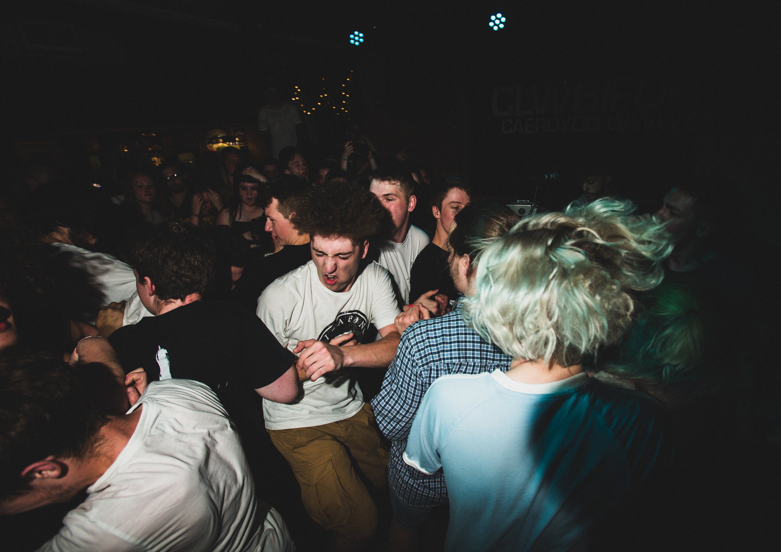
I’m sure about the subtractions but a little unsure on the live shot with the mic. After speaking with Spencer, I agreed with him that having a live ‘pit’ image would be a cool homage. I tried it above with a front man and the mic but I don’t feel it has the right flow. I sent of some potentials to talk about but the strongest so far is the image that got selected for the ‘Photographers United - open Call’
Photographers United Exhibition selected image, Chris Chucas 2018.
Some other selects to choose from -
Some discussion and thinking about it, I am sitting on these 3 as the strongest -
Final Gallery v5 - I’ve swapped out some of the smiling portraits with the others suggestions. I need to re build a few compositions with them now.
Final Edit
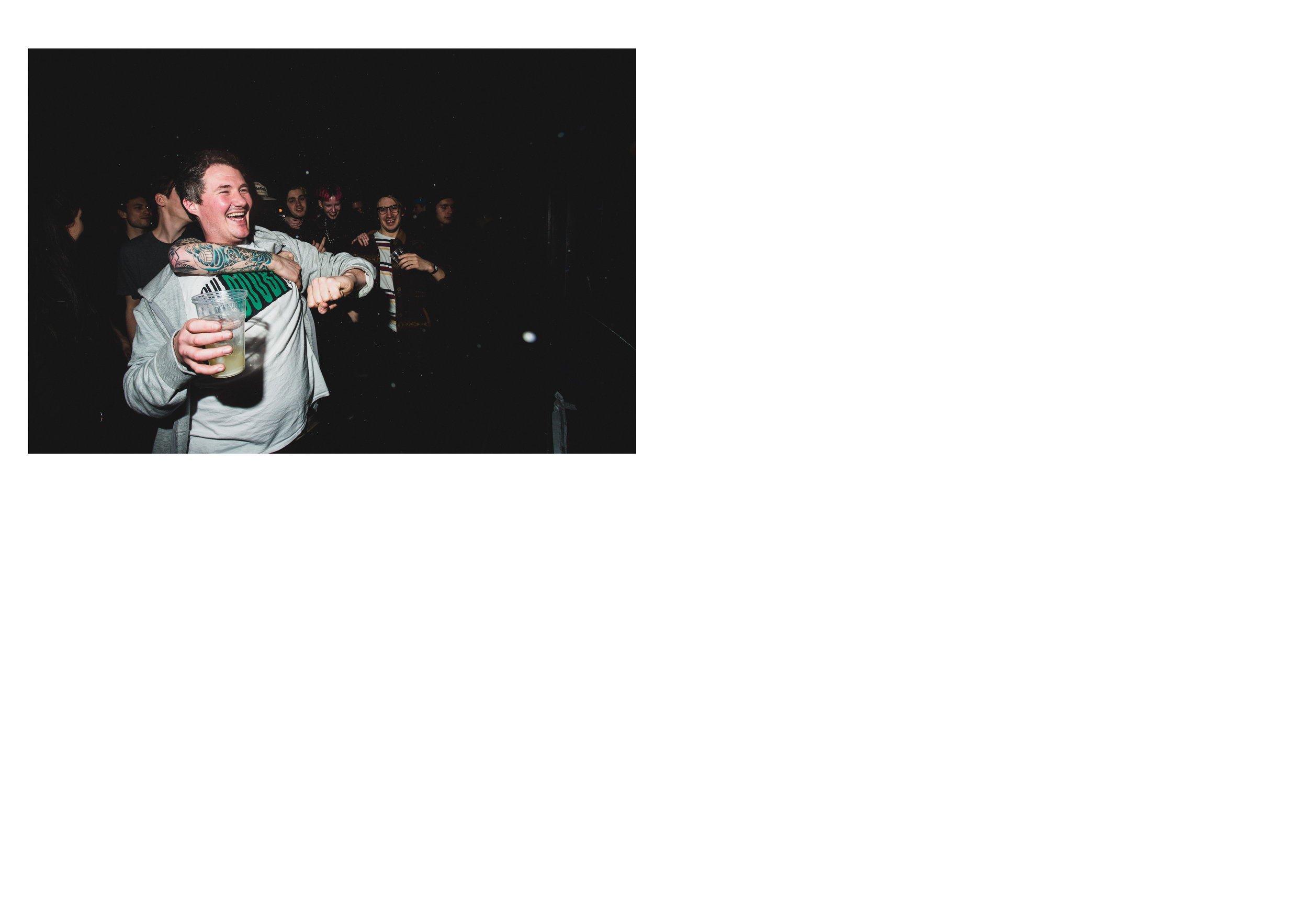
Im pretty confident with the latest edit but the one image I’m a tiny bit conflicted on is 3rd from left 2nd down, I like it as an image but I have a tiny nag that the expression is a tiny bit off for the se, part of me thinks that I’m over thinking it so I ‘m trusting my ‘gut’ which tells me to keep it. Now to prepare my FMP doc.


