After looking to finalize the text element to the practice I decided to try and collaborate with another graphic designer as the previous partnership didn’t pan out due to work commitments and logistics.
I shared some images with an artist I know from the punk scene, Exhume Industries.
I shared some images with him and also a text document with chosen lyrics to be incorporated. We talked at length about the look feel and desired outcome I wanted to archive and I left him to it.
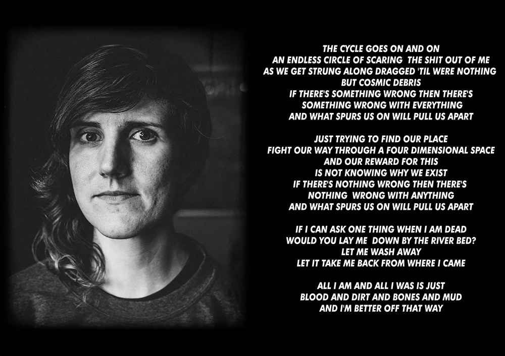
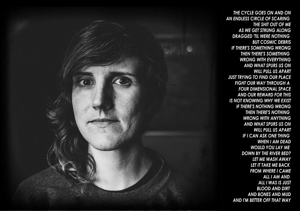
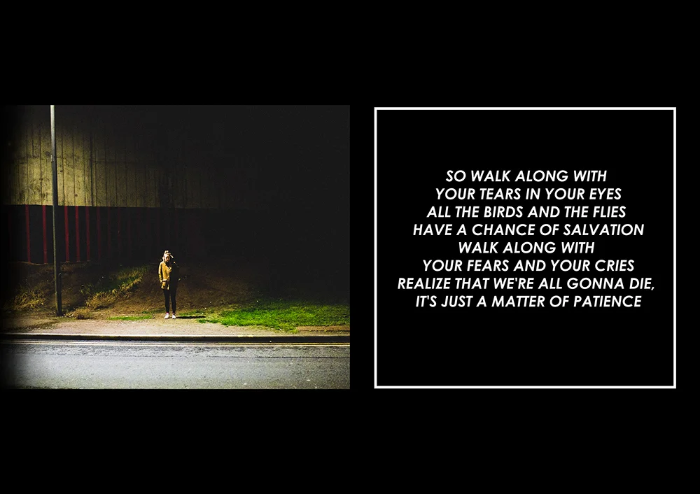
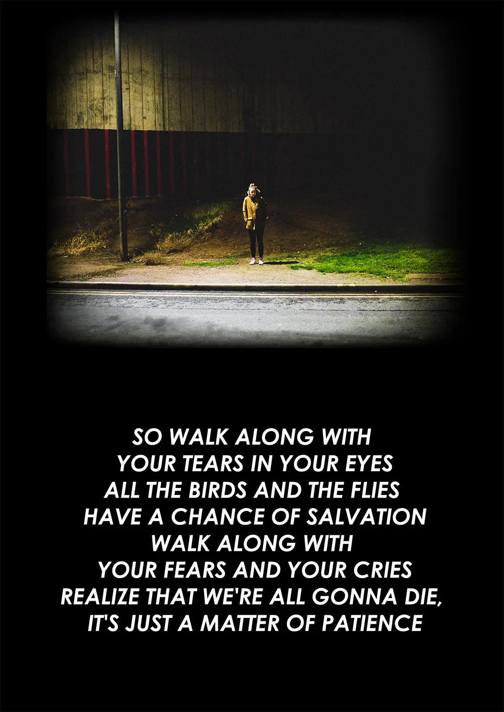
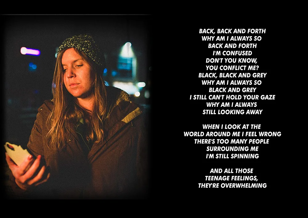
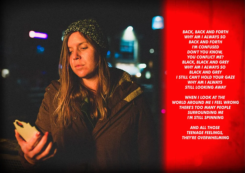
Here are some of the drafts he sent back.
He’s added a lot of the lyrics and interestingly using a sans serif font that is almost similar to Krugers work
EDIT - post discussing Barbara Kruger’s work here - https://www.chrischucas.com/crj2/fmp-working-with-text-dymo-labels?rq=barbara
I don’t think it’s quite what I’m looking to archive, I appreciate all of the work and time that he’s put into it and I had a tak with him but as he is an artist with preferences and motivations already I think that it’s just a bit of a mismatch. Thinking of it from a location of practice POV it doesn’t sit right with me the style, and it also would be quite difficult to integrate into established photographic spaces. That’s not a deal breaker but as I’m personally not feeling it that with the other reasons is enough for me to call it a day and look at other ways forward.
